

Last week I mentioned a kitchen project I have been helping with. I have also been helping to choose paint colours for the brand new home.
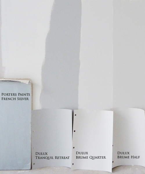
The dutchess satin paint from Porters Paints in French Silver is going to look great on the wall behind the bar. It gets a lot of natural light in that area and will play off nicely with the stainless steel in the kitchen nearby.
Dulux Tranquil Retreat is for a large curved wall in the living area, Brume (1/4) for the walls and Brume (1/2) for the bedrooms. Also for the bedrooms I have suggested the above papers but we are not too sure at this stage if we'll go ahead with wallpaper. I love them both so much.
Am I having fun in the land of paint and paper? You bet. How has your weekend been?
(Image 2: ferm living Image 3: Catherine Martin wallpaper from Porters Paints)


